We Are Here to Help!
Get pricing details and strategies that will work for your business.
In modern dentistry, connecting with patients and fostering lasting relationships goes beyond the confines of oral care expertise. It requires effective dental marketing, too.
Picture this situation: A forward-thinking dentist wants to take a different route to engage with his new patients. He sends out postcards featuring cheerful tooth characters, offering quick dental tips and reminders. A busy mother receives the postcard in her mailbox just as her son complains about a toothache. The result? The practice now has a new patient!
In this article, we will show you how you can create the perfect dentist postcards that resonate, motivate, and ultimately drive the success of your dental practice.
Understanding Your Audience
Before embarking on any marketing journey, one essential step is to define your target audience. You can do this by identifying key demographics such as age, gender, location, and socio-economic status of those you want to market to.
It's also crucial to analyze patient preferences and requirements. What oral health services are they seeking? Do they value preventive care, aesthetics, or emergency services? By understanding these needs, you can align your marketing and direct mail postcard's messaging and imagery with what matters most to your audience.
How to Design an Eye-Catching Postcard
To create the perfect dental postcards, there are a few things you should consider. To make things easier, we have divided our postcard design tips into three main groups: imagery, typography and text elements, and color. Let's explore each in detail.

Choosing Appropriate Imagery
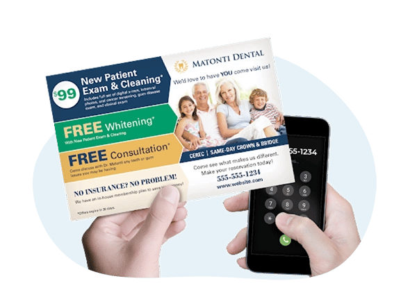
Selecting images that showcase your practice's expertise is essential when it comes to direct mail marketing. High-resolution photos of your clinic, equipment, and staff, for example, can help you convey professionalism and build trust in the entire process.
Pro tip: Featuring genuine smiles of satisfied patients can create an emotional connection. You can also showcase before-and-after photos or capture authentic moments that resonate with your target audience.
Typography and Text Elements
Opt for clear, easy-to-read fonts that align with your brand's tone in your direct mail products. Legibility is crucial to ensure your message isn't lost due to overly intricate fonts.
Pro tip: Your headlines and taglines should be concise yet impactful. Use language that resonates with your audience and clearly conveys the benefits of your services.
Color Psychology in Postcard Design
For your own design, select colors that align with your practice's identity and the message you want to convey, like calming blues, energetic yellows, or trustworthy greens. For dental providers, some good color combinations include blue and white, green and white, and pastel shades.
Pro tip: Ensure that your postcard's color scheme harmonizes with your practice's branding. Consistency reinforces your practice's identity and creates a sense of familiarity.
Crafting Compelling Content
Your postcard's content should showcase your range of services. Focus on what sets your practice apart, emphasizing the benefits and showcasing how your services can improve lives – whether it's enhancing smiles, boosting confidence, or ensuring oral health!
The call-to-action is also a vital component of dental direct mail campaigns and patient acquisition. Clearly state what action you want recipients to take, such as scheduling an appointment or calling for more information. Limited-time offers, or exclusive discounts can incentivize recipients to act swiftly.
And remember: Effective content goes beyond mere information; it captures attention, sparks interest, and prompts action.
Layout and Structure
When designing your direct mail dental postcard, it’s important to organize information in a logical sequence and utilize both sides of the card. Reserve the front for attention-grabbing visuals and headlines, while the back can carry essential information, details about services, and your call-to-action.
Avoid overwhelming the postcard with too much text and let images and whitespace breathe. Visuals should complement the text and create a cohesive narrative.
Printing and Distribution
The paper you choose can impact how your postcard feels and looks. Opt for a sturdy paper stock that exudes professionalism. Finishes like matte, glossy, or textured add tactile appeal and reinforce your practice's image.
Once you've decided on your design and postcard size, it's time to select a printing method. Digital printing offers flexibility for smaller quantities, while offset printing can be cost-effective for larger runs.
More importantly, though, maximize your postcard's impact by targeting the right audience. Segment your mailing list based on demographics and preferences. Utilize geographic targeting to focus on areas where your practice operates and don't forget to use trustworthy direct mail services with excellent customer service and experience working with dental practices.
A Note On Measuring Success
Define clear objectives for your postcard campaign. Whether it's increasing appointment bookings, growing patient referrals, or raising awareness about a new service, setting specific and measurable goals for your direct mail marketing (including postcard marketing as well as online marketing) and mailing services will help guide your efforts.
Whenever possible, implement tracking mechanisms to measure the effectiveness of your postcard campaign. For example, you can monitor response rates by analyzing how many recipients took the desired action – be it scheduling an appointment or visiting your website.

Conclusion
When crafting your eye-catching postcard for your dental practice, always strive to strike a balance between visual appeal and effectively conveying important information. So, make sure you rely both on custom designs and great service! And remember that, in the journey from design to delivery, your postcard's physical form matters as much as its content when it comes to new patients reaching out to you.
The right printing method, paper quality, and strategic distribution will ensure that your mail piece message reaches the right hands with a tangible impact.
If you want to ensure your postcard stands out and leaves a lasting impression, why not talk to direct mail experts? Cactus Mailing has successfully helped thousands of companies craft the perfect direct mail campaign. Contact us today to find out more about our custom design dental marketing services and get a free no-obligation marketing plan to grow your practice.

 Mike Ryan: Oct 18, 2023


 Cactus Mail Team